Visuals are the most essential part of your website. If your brand looks dynamic and vibrant it’s because of the use of unique and innovative visual design. Interestingly design trends keep evolving early, not only due to trends but also because of technological platforms.
As the time changes, innovative, creative, and unique design ideas are required to create set brands apart from a sea of competitors. Designers are constantly experimenting with new ideas to give tomorrow’s brand a fresh look.
BRANDS DESIGN TRENDS FOR 2019
2018 has been very interesting so far for brands in terms of new graphical elements, let’s take a look into the graphic trends that will most certainly continue to impact the visual landscape in 2019.
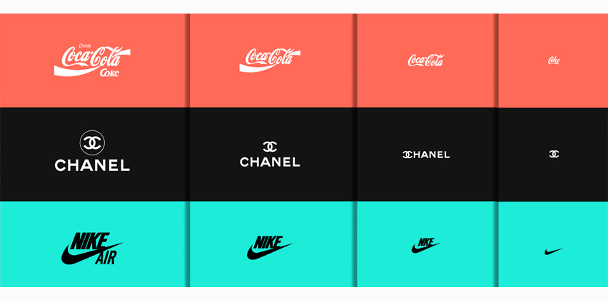
MINIMALISM
Over the past few years, simple (flat) design has been extremely popular in the digital world. In 2019, designers will continue to focus on simplistic and classical designs. These designs are able to load fast and look beautiful on various screen sizes. As you know the number of smartphone users is rising day by day, as per many forecasts, leading to the minimalism trend to continue into the year ahead.

WARMER TONES & VARIOUS SHAPES OF COLOR PANELS
In 2019, bright colors will be seen in the logo and web design. According to many predictions, people will prefer warmer and more natural tones in interior design. Similarly, unusual color combinations will be used for logo design in 2019. For example, pale green and pink colors, dirty yellow shades along with grey-violet will be opted by different famous companies. Aspen Gold is the trending color for spring 2019.
GEOMETRIC SHAPES
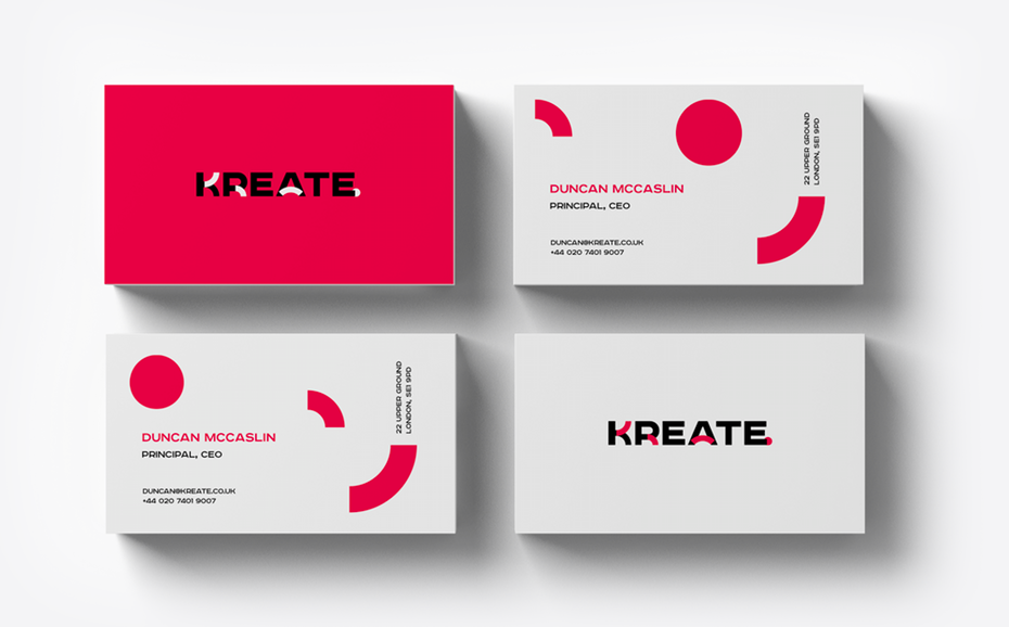
Different logo designs will use multiple combinations of simple geometric shapes. However, geometric shapes are pretty simple from a technical point of view, they provide endless possibilities to design the logo of your choice that attracts the customers. Such decisions are a great option for organizations having a wide range of target audience.

ASYMMETRIC LAYOUTS
In the last few years, grid layouts have ruled the design world, but in 2018, we started to observe more and more asymmetrical layouts that replaced the grid form. These layouts might still be on a grid platform, but feature unique and innovative shapes and different sizes on the grid. As the market demand changes, designers are trying new techniques to seize the attention of the audience. They know the same old layout everyone uses, so they are ready to create something unique.
OVERLAPPING
Overlapping will be a logo design trend for next year. The use of bright shapes with warms colors that overlap each other will be very highly popular among many companies. A new color, which is created by overlapping the area of two colors, forms an eye-catching logo. Such logos impart interesting meaning that is important in the development of any quality business.
FONTS
Observing the trends of 2018, experts agree on the fact that it was a period that involved a lot of textual logos. Hence, this trend has given more opportunities for experimenting with fonts. Some techniques are still being actively used, including Indents, Kerning, and Alignment of letters. Interestingly, this trend will likely to continue in the year 2019.

ILLUSTRATIONS
Storytelling has become a strong part of branding and advertising, but the fact remains that a compelling narrative can be enormously effective when it comes to engaging consumers, and getting across a brand’s personality and purpose.
Illustrations are a great way of taking people on a journey, whether you’re literally walking people through a brand’s story using illustrated scenes or characters or constructing a subtler narrative across various brand touchpoints.
These are just a few of the design trends that will be observed in 2019. Diving into the design trends made popular in 2018 is a good way to have a better idea of the eye-catching design elements in 2019. The things that did not work particularly well are likely to fade away. While the things that users responded to are likely to grow in continue to evolve.
